In interface design, illustration, layout, and branding, the choice between a standard rectangle and a rounded rectangle may seem minor. In practice, it affects readability, perceived tone, visual hierarchy, and how users understand interactive elements. Both tools create simple geometric shapes, but they communicate different levels of structure, softness, emphasis, and approachability.
TLDR: Use the Rectangle Tool when you need precision, structure, strong alignment, or a formal visual tone. Use the Rounded Rectangle Tool when you want a softer, more approachable shape, especially for buttons, cards, badges, and user interface containers. For example, in a mobile app dashboard with 12 content cards, using rounded rectangles can make the layout feel more touch friendly, while square rectangles may be better for strict data tables or technical diagrams. In usability reviews, teams often find that small radius corners improve perceived clickability because they resemble common app buttons and cards.
Understanding the Rectangle Tool
The Rectangle Tool creates shapes with four straight sides and sharp 90 degree corners. It is one of the most basic and reliable tools in visual design. Because it produces clean, rigid forms, it is commonly used for grids, frames, backgrounds, charts, banners, table cells, architectural layouts, and structured compositions.
A rectangle communicates order, stability, accuracy, and authority. Its sharp corners make it feel more formal and sometimes more technical. This is why rectangles appear frequently in corporate layouts, editorial systems, financial dashboards, construction diagrams, and professional presentation decks.
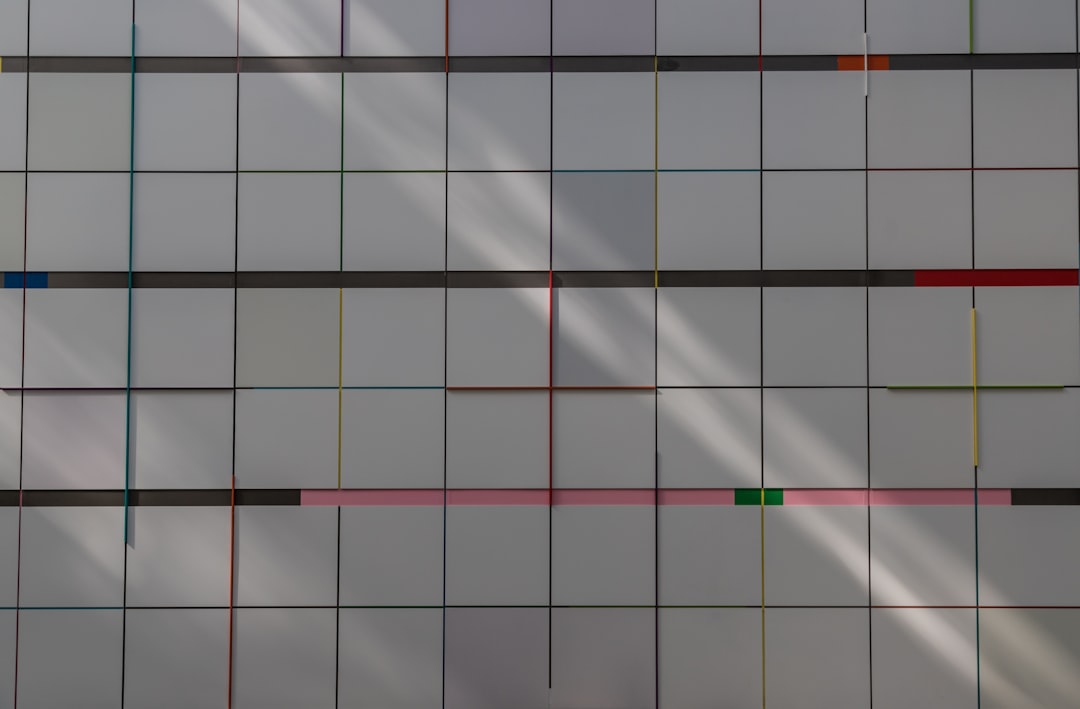
Use the Rectangle Tool when the design needs to feel controlled and exact. For example, a financial report with multiple data blocks may benefit from rectangular containers because they reinforce a sense of discipline and clarity. Similarly, a website wireframe often starts with rectangles because they help designers map sections without adding unnecessary personality too early.
Understanding the Rounded Rectangle Tool
The Rounded Rectangle Tool creates a rectangle with softened corners. Depending on the corner radius, the shape can look only slightly softened or almost pill shaped. This tool is widely used in digital interfaces because rounded corners are visually approachable and easy to associate with interactive components.
Rounded rectangles often communicate comfort, accessibility, friendliness, and modernity. They appear in buttons, notification cards, input fields, app icons, tags, profile containers, and call to action areas. A small radius can make a layout feel polished without becoming playful. A large radius can create a more casual or consumer friendly appearance.
However, rounded corners should not be used automatically. If every element has a different corner radius, the design can look inconsistent. The key is to define a clear radius system, such as 4 pixels for small controls, 8 pixels for cards, and 16 pixels for large panels.
When to Use the Rectangle Tool
The Rectangle Tool is the better choice when clarity and structure are more important than softness. It works especially well in designs that depend on alignment, measurement, and strong visual boundaries.
- Data tables and spreadsheets: Sharp rectangular cells create clean separation and make large amounts of information easier to scan.
- Technical diagrams: Rectangles support precision and reduce ambiguity in flowcharts, engineering sketches, and system maps.
- Editorial layouts: Magazine grids, article blocks, and image frames often need firm edges to maintain rhythm and hierarchy.
- Formal branding: Law firms, financial institutions, and industrial companies may prefer rectangles for a more serious visual voice.
- Background sections: Rectangles are ideal for full width content blocks, headers, footers, and structured panels.
Rectangles are also useful when you want shapes to meet cleanly. For instance, if several panels sit side by side, rounded corners can create awkward gaps or visual noise between them. Square corners allow sections to connect seamlessly.
When to Use the Rounded Rectangle Tool
The Rounded Rectangle Tool is best when you want an element to feel selectable, contained, and visually comfortable. It is especially effective in product interfaces where users need to understand what can be tapped, clicked, edited, or opened.
- Buttons: Rounded rectangles are a standard choice for calls to action because they feel inviting and clearly interactive.
- Cards: Product cards, article previews, and dashboard widgets often benefit from rounded corners because they look self contained.
- Input fields: Slightly rounded fields can feel more modern and less rigid than square fields.
- Labels and tags: Rounded edges help small pieces of metadata feel compact and readable.
- Mobile interfaces: Rounded rectangles align well with touch based interaction patterns and contemporary app design.

A rounded rectangle is particularly useful when the design includes multiple independent components. For example, a project management dashboard might use rounded cards for tasks, deadlines, and team updates. The softened corners help each card stand apart while still feeling part of the same system.
How Corner Radius Changes Perception
The difference between a rectangle and a rounded rectangle is not just geometric; it is psychological. Corners draw attention. Sharp corners can feel decisive and efficient, while rounded corners can feel safer and more relaxed. In user interface design, this can influence how people interpret the purpose of an element.
A 2 to 4 pixel radius usually creates a subtle professional softness. An 8 to 12 pixel radius feels more modern and visible. A fully rounded pill shape works well for compact buttons, filter chips, and status labels, but it may feel too informal for dense enterprise software.
Consistency matters more than the exact number. A serious analytics platform might use a 4 pixel radius throughout the interface. A wellness app might use 16 pixel cards and pill shaped buttons. Both approaches can be effective if they support the product’s tone and remain consistent.
Common Mistakes to Avoid
One frequent mistake is using rounded rectangles only because they look trendy. Rounded corners should serve a purpose, such as improving perceived clickability, separating cards, or matching a friendly brand tone. If they reduce clarity or make the interface look too soft, rectangles may be the stronger choice.
Another mistake is mixing too many corner styles. A layout with square cards, 6 pixel buttons, 14 pixel forms, and pill shaped banners can feel unplanned. Establish a small set of rules and apply them consistently.
- Do not over round technical layouts: Too much softness can weaken precision.
- Do not use sharp rectangles for every interactive element: Important buttons may look less inviting.
- Do not ignore scale: A radius that works on a large card may look strange on a small icon or field.
- Do not sacrifice alignment: Rounded shapes still need clean spacing, padding, and grid discipline.
Choosing Based on Context
The best choice depends on the message and function of the design. If the object is structural, informational, or part of a strict layout, start with a rectangle. If the object is interactive, personal, or part of a modern interface, consider a rounded rectangle.

For serious business software, a balanced approach often works best. Use rectangles for tables, charts, page sections, and data heavy areas. Use rounded rectangles for buttons, cards, filters, and notifications. This creates a hierarchy where structural elements feel stable and interactive elements feel approachable.
In branding, the decision should match the organization’s personality. A logistics company may rely on rectangles to suggest reliability and efficiency. A children’s education platform may use rounded rectangles to feel safer and more welcoming. Neither shape is universally better; each has a role.
Practical Decision Checklist
Before choosing one tool over the other, ask a few practical questions:
- Is the element mainly structural? Use the Rectangle Tool.
- Is the element meant to be clicked or tapped? Use the Rounded Rectangle Tool, in most cases.
- Does the brand need to feel formal and precise? Favor rectangles or very small corner radii.
- Does the brand need to feel friendly and accessible? Favor moderate rounded corners.
- Will multiple shapes sit directly against each other? Rectangles may align more cleanly.
- Will the shape contain independent content? Rounded rectangles may help separate it visually.
Ultimately, the Rectangle Tool and Rounded Rectangle Tool are not competitors as much as complementary instruments. The rectangle provides discipline, structure, and authority. The rounded rectangle provides softness, usability cues, and modern interface appeal. A trustworthy design uses both intentionally, based on function, audience, and visual tone rather than habit or decoration.