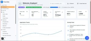

In many organizations, decisions slow down because managers are forced to interpret scattered spreadsheets, delayed reports, and conflicting metrics. A well-built management dashboard changes that by presenting the right data, at the right time, in a format that supports faster and more accurate action. When designed around business priorities instead of visual decoration, a dashboard can realistically improve decision-making quality by 25% through clearer visibility, fewer reporting delays, and stronger accountability.
TLDR: A management dashboard improves decision-making when it connects business goals, key metrics, real-time data, and clear visual storytelling. For example, a regional sales company that reduced weekly reporting time from 10 hours to 3 hours and tracked conversion rates daily could identify underperforming territories 25% faster within one quarter. The best dashboards focus on action, not just information. They help managers see what changed, why it matters, and what should happen next.
Why Management Dashboards Matter
A management dashboard is more than a collection of charts. It is a decision-control system that helps executives, department heads, and team leaders understand performance at a glance. When properly structured, it reduces uncertainty by turning raw data into practical insight.
Many companies still rely on monthly reports that arrive too late to influence outcomes. By the time a sales decline, cost increase, or operational delay appears in a traditional report, the damage may already be done. A management dashboard solves this by creating a near real-time view of critical business activity.

Step 1: Define the Decisions the Dashboard Must Improve
The most effective dashboard projects begin with a simple question: Which decisions need to become faster, better, or more consistent? Without this clarity, dashboards often become cluttered displays of unrelated metrics.
Management should identify the recurring decisions that have the greatest impact on performance, such as:
- Whether to increase or reduce spending in a department
- Which sales regions need immediate support
- Where operational bottlenecks are affecting delivery times
- Which products or services are becoming less profitable
- Whether customer satisfaction is improving or declining
For example, if a logistics firm wants to reduce late deliveries, the dashboard should include delivery completion rates, route delays, driver capacity, warehouse processing time, and customer complaint trends. It should not prioritize unrelated vanity metrics that do not support the decision.
Step 2: Select Metrics That Connect to Business Goals
A dashboard improves decision-making by 25% only when it measures what truly matters. Management teams should separate strategic metrics from operational noise. A useful metric should be relevant, timely, understandable, and linked to a business objective.
Common dashboard metric categories include:
- Financial metrics: revenue, gross margin, cash flow, budget variance
- Sales metrics: pipeline value, win rate, conversion rate, average deal size
- Customer metrics: satisfaction score, churn rate, retention rate, support response time
- Operational metrics: productivity, cycle time, defect rate, delivery performance
- People metrics: employee utilization, turnover, training completion, absenteeism
The best approach is to limit the main dashboard to 8 to 12 core KPIs. This keeps attention focused. Additional detail can be placed in drill-down views for managers who need deeper analysis.
Step 3: Build a Clear Data Structure
No dashboard can improve decisions if the underlying data is inaccurate. Before design begins, organizations must confirm where data comes from, how often it updates, who owns it, and how it is validated.
Strong data structure usually includes:
- Reliable sources: CRM, ERP, accounting software, support platforms, and operations systems
- Consistent definitions: one agreed meaning for terms such as revenue, active customer, or completed order
- Automated updates: data refreshes that reduce manual copying and spreadsheet errors
- Access controls: role-based permissions that protect sensitive information
For instance, a company may discover that finance defines monthly revenue based on invoices issued, while sales defines it based on signed contracts. A dashboard that mixes both definitions will confuse managers and weaken trust. Standardization is essential.
Step 4: Design for Fast Interpretation
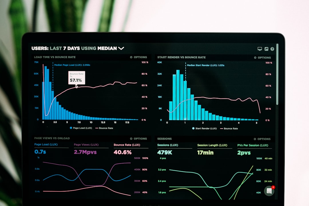
Dashboard design should make the most important insight visible within seconds. Managers should not need to study a chart for several minutes to understand whether performance is good, bad, or changing.
Effective design principles include:
- Using simple charts such as line graphs, bar charts, scorecards, and tables
- Applying colors consistently, such as green for on-target and red for critical issues
- Grouping related metrics together
- Showing trends over time instead of only current totals
- Adding context through targets, benchmarks, and previous-period comparisons
A dashboard showing that revenue is $2.4 million is useful, but a dashboard showing that revenue is 8% below target and 12% lower than the same quarter last year is far more valuable. Context turns data into direction.

Step 5: Include Leading and Lagging Indicators
Many dashboards rely too heavily on lagging indicators, which show what has already happened. Revenue, profit, and churn are important, but they often reveal problems after they have developed. To improve decision-making, dashboards should also include leading indicators that signal future outcomes.
Examples include:
- Lagging indicator: monthly sales revenue
- Leading indicator: number of qualified opportunities created this week
- Lagging indicator: customer churn rate
- Leading indicator: decline in product usage or support satisfaction
- Lagging indicator: project completion rate
- Leading indicator: unresolved blockers or resource shortages
This balance allows managers to respond earlier. If a software company sees product usage decline by 18% among enterprise clients, customer success leaders can intervene before churn appears in quarterly results.
Step 6: Add Alerts and Decision Triggers
A dashboard becomes more powerful when it does not simply display information but actively draws attention to change. Alerts and decision triggers help managers act before small problems become expensive failures.
Useful triggers might include:
- Inventory dropping below a defined threshold
- Customer churn risk rising above 15%
- Sales pipeline coverage falling below 3 times the monthly target
- Operating costs exceeding budget by more than 7%
- Support response time exceeding service-level agreements
These triggers should be connected to clear ownership. If a metric turns red, the responsible manager should know what action is expected. Without accountability, alerts become background noise.
Step 7: Test the Dashboard With Real Management Workflows
Before a dashboard is fully launched, it should be tested in actual management meetings. This reveals whether the dashboard supports real decisions or merely looks impressive.
During testing, leaders should ask:
- Can the core business situation be understood in under five minutes?
- Are there any metrics that create confusion?
- Does the dashboard show causes, not just symptoms?
- Can managers identify the next action from the data?
- Are any important decisions still dependent on offline spreadsheets?
If the dashboard does not change the quality of conversation, it needs refinement. The goal is fewer debates about whose data is correct and more discussion about what action should be taken.
How the 25% Improvement Can Be Measured
The claim of improving decision-making by 25% should be measured with practical business indicators. Although decision quality can seem difficult to quantify, organizations can track process and outcome improvements.
Measurement options include:
- Decision speed: reducing approval or response time from 8 days to 6 days
- Forecast accuracy: improving revenue forecast accuracy from 70% to 87.5%
- Meeting efficiency: reducing time spent preparing reports by 25%
- Issue detection: identifying performance problems one week earlier than before
- Action completion: increasing follow-through on management decisions by 25%
For example, a retail chain using a dashboard to track store performance may reduce stockout response time from 4 days to 3 days. That represents a 25% improvement in response speed and can directly support higher revenue and better customer satisfaction.
Common Mistakes to Avoid
Several dashboard mistakes can reduce impact. The first is adding too many metrics. When everything is important, nothing stands out. The second is using charts that look attractive but do not clarify decisions. The third is failing to assign metric ownership.
Another serious mistake is treating the dashboard as a one-time project. Business needs change, and dashboards must evolve. A quarterly review helps ensure the dashboard still reflects current priorities, market conditions, and leadership goals.
Final Thoughts
A management dashboard improves decision-making when it is built around clarity, speed, and accountability. It should help leaders understand performance, identify risk, compare results against targets, and act with confidence. When the dashboard combines relevant KPIs, accurate data, intuitive design, and clear decision triggers, a 25% improvement becomes a realistic and measurable business outcome.
FAQ
What is a management dashboard?
A management dashboard is a visual reporting tool that displays key business metrics, trends, and alerts so leaders can monitor performance and make informed decisions.
How many KPIs should a management dashboard include?
Most main dashboards should include 8 to 12 core KPIs. Additional metrics can be available through drill-down pages or department-specific views.
How can a dashboard improve decision-making by 25%?
It can improve decision-making by reducing reporting delays, increasing forecast accuracy, identifying issues earlier, and helping managers act faster with trusted data.
How often should dashboard data update?
The update frequency depends on the business need. Sales and operations dashboards may update daily or hourly, while strategic executive dashboards may update weekly or monthly.
What makes a dashboard ineffective?
A dashboard becomes ineffective when it contains too many metrics, uses unclear visuals, relies on inaccurate data, or fails to connect insights with specific management actions.