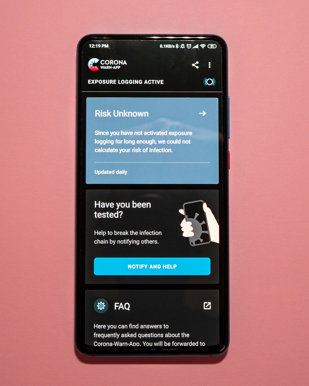
In today’s digital age, more and more users are researching, shopping, and interacting with brands from their smartphones or tablets. This shift has made mobile responsiveness a major factor in any online marketing strategy, especially when it comes to landing pages. If you’re using a landing page generator to drive traffic and conversions, mobile compatibility is not just an added bonus—it’s a necessity.
Landing pages are designed with one goal in mind: conversion. Whether it’s to collect email addresses, sell a product, or get users to sign up for a webinar, these standalone pages must be optimized to reduce friction and maximize action. If a visitor opens a landing page on their phone and encounters text that is too small, buttons that are hard to tap, or images that don’t scale correctly, chances are they’ll bounce within seconds.
Why Mobile Responsiveness Matters
There are several reasons why mobile responsiveness should be at the core of your landing page strategy. Let’s explore the most significant ones:
- Increasing Mobile Traffic: According to recent statistics, over 60% of global web traffic now comes from mobile devices. Ignoring mobile users means alienating a massive portion of your potential audience.
- User Experience: A mobile-optimized landing page ensures that visitors have a smooth, intuitive experience. Clear fonts, responsive buttons, and fast loading times help in retaining user attention.
- Search Engine Rankings: Google’s algorithms prioritize mobile-friendly websites and pages in search results. If your landing page isn’t responsive, you’re likely to lose visibility and organic traffic.
- Higher Conversion Rates: A page that renders correctly on any screen builds trust and encourages users to take action, thereby improving your conversion rates.

Features to Look for in a Mobile-Responsive Landing Page Generator
Not all landing page builders are created equal. When choosing one, ensure it includes the following mobile-responsive features:
- Drag-and-Drop Editing with Mobile Preview: A good builder allows you to toggle between desktop and mobile view as you design, so you can see how your content will appear across different devices.
- Adjustable Layouts: Look for tools that let you tailor spacing, text size, and element arrangement specifically for mobile users without affecting the desktop version.
- Fast Loading Speed: Mobile users expect instant access. A good generator will output lightweight, optimized code that ensures quick loading times on cellular networks.
- Touch-Friendly Elements: Buttons and menus should be large enough to tap easily, and forms must be simple to complete using mobile keyboards.
Real-World Consequences of Poor Mobile Optimization
Imagine launching a digital ad campaign that drives thousands of users to your beautifully crafted landing page, only to discover that a majority of them leave within seconds. Why? Because the page doesn’t work well on a smartphone. This isn’t a hypothetical situation—it’s the reality many marketers have faced when neglecting mobile responsiveness.
Even a strong offer or compelling call-to-action can be undermined if the page doesn’t render correctly. Graphic elements may be misaligned, text may overlap, or the user might have to pinch and zoom to read the content. Such frustrations cause users to abandon your page, costing you both leads and money.
Mobile Responsiveness and Brand Perception
Your landing page is often the first point of interaction a prospect has with your brand. A seamless mobile experience sends a clear message that your business is professional, up to date, and user-focused. On the other hand, a clunky mobile interface communicates laziness and an outdated approach to customer engagement.

Tips for Optimizing Mobile Landing Pages
Here are some final best practices to ensure your landing pages perform well across all devices:
- Use a Single, Clear Call-to-Action: Keep it prominent and accessible without the need for scrolling.
- Minimize Load Times: Compress images and avoid unnecessary scripts.
- Simplify Navigation: Avoid complex menus or links that take users away from the page.
- Test Across Devices: Use emulators or real devices to test responsiveness before launch.
In conclusion, mobile responsiveness isn’t just a technical specification—it’s a fundamental element of effective digital marketing. With the majority of web users accessing content via mobile, your landing page generator must deliver a seamless experience across various screen sizes. Anything less could mean missed opportunities and lost revenue.


