

Designing a double-sided brochure goes beyond choosing the right fonts and layout—it requires selecting a color scheme that conveys your brand’s message effectively while maintaining visual harmony. Whether you’re promoting an event, announcing a new product, or building brand awareness, your color choices can make or break your brochure’s impact.
Color influences perception and emotion. It affects how your audience interprets your content and whether they engage with it. Therefore, selecting the right color scheme is a crucial decision in your brochure design process.
Understand Your Purpose and Audience
Before diving into swatches and color palettes, consider the brochure’s purpose and target audience:
- Who will read it? Are you targeting professionals, students, or families?
- What message are you conveying? Is the tone playful, serious, or inspirational?
- What action do you want readers to take? Visit a website? Sign up for a service? Explore a location?
Tailoring your color scheme to suit your audience’s demographics and cultural context ensures stronger engagement. For example, muted earth tones might work well for an eco-tourism company, while vibrant, high-contrast colors may better suit a nightclub flyer.
Tap into Color Psychology
Colors evoke emotions and associations. Understanding basic color psychology can help you intentionally guide your reader’s feelings:
- Red: Energy, urgency, passion
- Blue: Trust, professionalism, calm
- Green: Growth, health, environment
- Yellow: Optimism, youth, friendliness
- Purple: Creativity, luxury, mystery
- Black: Elegance, sophistication, power
Carefully balance these meanings with your brand identity and brochure content to avoid confusing or overwhelming the reader.
Choose a Cohesive Color Palette
Once you’ve established emotional intent, choose a color palette that supports it. Most effective brochure designs use a primary color and 2–3 accent colors.
Use these tips to build a balanced palette:
- Analogous schemes use colors next to each other on the color wheel and create harmony and subtlety.
- Complementary schemes use opposing colors to create contrast and energy.
- Monochromatic schemes use varying shades of one color, perfect for a sleek and professional look.
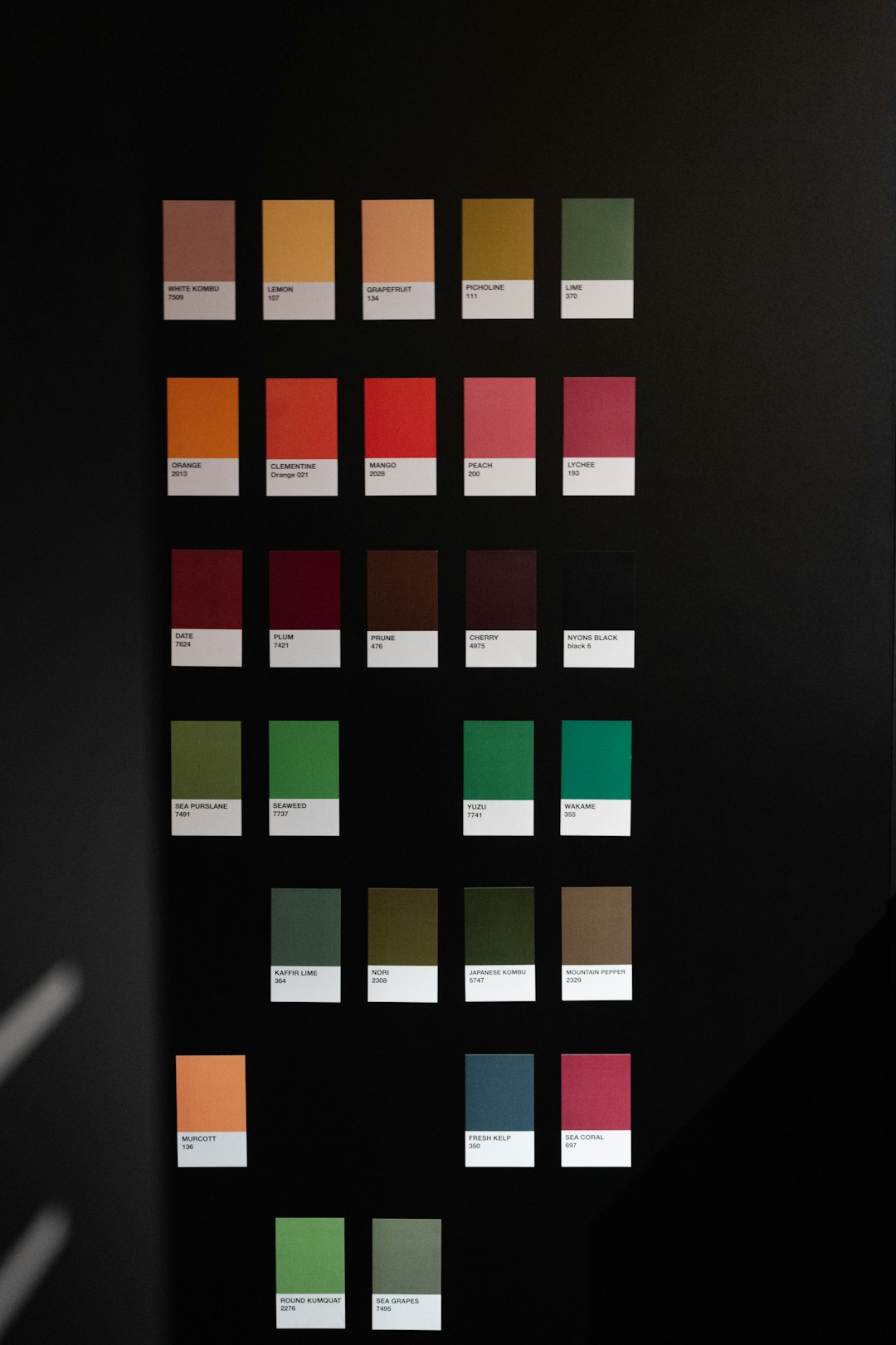
Free tools like Adobe Color, Coolors.co, or Canva’s Color Palette Generator can help you choose and visualize your palette.
Use Color Effectively on Both Sides
When designing a double-sided brochure, consistency is crucial. However, you can also use the second side to present a slight shift in tone or emphasis—especially if you’re targeting different types of messaging on each side.
Here’s how to ensure color harmony:
- Maintain a consistent background or border color across both sides.
- Repeat accent colors to tie the flyer together visually.
- Vary use of space and typography rather than introducing entirely new colors.
This design cohesion enhances professionalism and prevents the brochure from feeling disjointed.
Consider Printing Constraints
Even the best color scheme can fall flat if you don’t plan for print. Consider these practical limitations:
- CMYK vs. RGB: Print uses CMYK color mode; make sure your design reflects that for accuracy.
- Paper type: Glossy paper may make colors pop more, while matte papers may dull some hues.
- Budget: Full-color double-sided printing can be costly. Using a strategic two-color palette can reduce costs while maintaining impact.
Test and Get Feedback
Before finalizing your design, print a test copy or create a high-quality digital mock-up. Examining your brochure with critical eyes—or better yet, asking others—can reveal unexpected issues such as colors appearing muddier in print or backgrounds that distract from text.
Furthermore, observe your brochure in natural and artificial lighting to ensure your color choices maintain legibility and appeal in various settings.
Final Thoughts
Choosing the perfect color scheme for a double-sided brochure is a blend of psychology, branding, and practicality. When done thoughtfully, color not only reinforces your message but also ensures your brochure stands out in a sea of visual competition.
By aligning your color choices with both your brand and your audience’s expectations, your brochure becomes more than just a printed handout—it becomes a compelling communication tool.